 |  Home > Application Framework > Presentation Layer Home > Application Framework > Presentation Layer
The presentation layer of the StrataFrame Application Framework has been designed
with both the end user and the developer in mind. Not only are the included
controls functional and user-friendly, but they are also quickly configured
and easily extended.
|  |
Overview
The presentation layer is comprised of a complete collection of user interface
controls for both WinForms and WebForms programming as well as the following features:
- Advanced controls that allow for quick list population
- Fully localizable controls
- Interfaces that can be implemented to create new bindable controls
- A straightforward and attractive messaging interface
Zero Code Binding for WinForms and WebForms
In tune with the developer friendly nature of StrataFrame, the presentation layer
contains a full complement of "Zero Code" bindable controls. Through the forms designer,
the developer can easily select the business object source and binding information
through type editors (pull down menus in the property sheet). All binding is
bidirectional regardless of the method of change: user-input or programmatic. When
a change is made to a bound control its corresponding business object will be
updated and vice-versa. Optimized For Speed
StrataFrame data-binding is six times faster than standard ADO.NET data binding to custom
controls. This functionailty is provided through the Business Object Mapper and the strong-typed
properties. Binding to a property versus a data row is natively faster. But to achieve extremely
fast binding, a field property descriptor is dynamically created for each field property which
eliminates the need for reflection and provides all of the information required by .NET when binding
to data. Since no reflection is used and all of the field property descriptors are compiled within
the assembly, forms instantiate much faster. This is especially important for forms that will house
a large number of bound controls.
Effortless List Control Population
Populating a list can be one of the most tedious and time consuming tasks for any
developer. StrataFrame’s class library contains several list controls that allow
for “Zero Code” list population. Its proprietary list editor enables the developer
to select the source for the list: business object type or enumeration type.
Additionally, the display attributes of the list (sorting, filters, etc.) can be
selected via the editor in order to direct the actual list population. Moreover,
the developer is not even required to manually populate the data source.
Auto-Management Features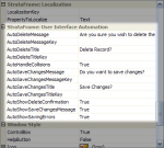 | UI Automation
View Larger Image | 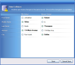 | Soft Collision Automation
View Larger Image | 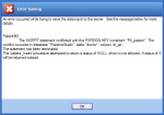 | Automatically Display Errors
View Larger Image |
The framework’s base form classes link any dropped business object directly to the
target form. While events raised by the business objects on the form can be handled
by the developer, the form is capable of automatically handling the events to present
messages to the end-user without intervention by the developer. The following are examples
of how the form will handle certain events:
- The form will show a “Save Changes?” dialog when it is closed while a business
object is still “dirty.”
- An error form is displayed when a Database exception occurs.
- The.NET error provider is automatically displayed when business rules are checked.
- A list of soft data collisions is presented to the user for resolution when a
concurrency exception occurs.
- A delete confirmation window is displayed when a record is deleted.
Note: Any automatic feature that exists on the presentation
layer can be disabled if the developer does not want to use it. The framework does not force
the developer to “Program around” any of the automation.
StrataFrame provides a collection of controls referred to as Themed controls. Some of these controls are
shown in more detail below. In addition to extending the developers control arsenal past the standard .NET toolbox, many
of these controls also support the StrataFrame application themes. These themes provide a fresh and attractive appearance to
any application with practically no effort!
Theme Styles
The framework comes with a number of pre-built themes that can be used by setting a single property. When set, the
Themed controls recognize that a theme has been applied and render based on the active theme. There are a number of
different effects that can be applied to the themed controls including glass-effects and refracted light. A pre-built theme
named "BlackIce" is included out-of-the-box which follows the Windows Vista appearance.
Optimized Rendering
The StrataFrame application themes do not use bitmaps or any external configuration files in order to apply a theme to a control.
All themed controls have properties that allow such effects as glass and gradients to be rendered. When a theme is applied to an
application, these properties are dynamically set by the theme. This is important because controls will render
much faster at run-time using this approach rather than using configuration files or bitmaps. Additionally, fewer resources are consumed
as more controls are added to a form, thus adding to the performance.
Pre-Localized Runtime Components
All StrataFrame components which provide pre-built interfaces, such as Role-Based Security, Browse Dialogs, and Maintenance Form Toolstrips are pre-localized out-of-the-box.
This includes all labels, tooltips, messages, broken rules, and anything that displays text to the end-user. Ready Out-Of-The-Box
StrataFrame uses its own localization engine to localize the runtime components. StrataFrame provides the ability
to use embedded XML files within an assembly which will be automatically loaded into the localization cache when the assembly
loads. This requires absolutely no code whatsoever on the part of the developer and will automatically follow the applications
selected language. Below is a list of the available languages which are pre-translated.
- English
- Spanish
- Portuguese
- German
- French
- Italian
- Russian
- Danish
- Greek
Feature Rich and Extended UI Controls
When developing commercial applications, the standard .NET collection does not meet the needs
of the normal developer. StrataFrame has extended the standard .NET controls to provide
expanded functionality, but more importantly, provides many exclusive controls to meet the
aesthetic and functional needs of an application. Below
are just a few of the extended controls that are ready to use out-of-the-box. Windows Theme Support
All StrataFrame controls have functionality to tie into the Windows Themes used by the
end-user. This functionality can be over-written by the developer, but provides a user
interface that is pleasing to the eye. If the end-user changes their Themes, by default, the
StrataFrame controls will follow suit and adjust to the new colors.
Browse Dialog Control
One function that all application developers need is the ability to provide an interface
to their end-users to search and retrieve data dynamically. The Browse Dialog allows a
developer to create a search dialog by simply dropping a control on a form and setting a few
properties. The dialogs can also be classed allowing a common browse dialog to be reused in
an indefinite number of locations.
The Browse Dialog also has a feature called the Information Panel. The information panel is
ultimately a user control that allows a developer to place any type of information, such as a
patient photograph or record details that would be difficult to show in the results list.
Maintenance Form Toolbar
The Maintenance Formm Toolbar is a toolstrip that is "pre-wired" for business object interaction. This control
just needs to be dropped on the form and will immediately work with the business objects without writing a single
line of code. The Maintenance Form Toolstrip allows records to be created, modified, deleted, navigated, saved, and undone.
Additionally, a Browse Dialog control can be associated with the toolbar and it will automatically launch and
manage the Browse Dialog.
The Maintenance Form Toolstrip can even be dropped on a StrataFrame User Control to provide isolated
and classed support when forms need to be dynamically created. In addition to the automated features, the developer
can easily control which buttons will appear and how the toolbar should behave by simply setting properties.
Gradient Form Header
The Gradient Form Header is a dockable control that is generally displayed on the top of a form and
provides a very attractive banner. The Gradient Form Header will follow the Windows Themes unless
the gradient colors are over-written by the developer. Additionally, an image can be associated with
the header and has support for shadowed text. This control really provides a balanced and aesthetically
pleasing appearance to a form.
Child Form Dialog
The Child Form Dialog is a revolutionary approach to dealing with shared data between multiple forms.
The Child Form Dialog control is a component that is dropped on a form. By simply setting two properties,
the child form will be instantiated and displayed when the ShowDialog method is called. This allows
the developer to drop a business object on the child form, and when called, all references, even those in
code, will be translated to the business object on the calling form. This allows a new child record to be
created on the calling form and when the child form displays, the new record will appear as though it had been
created on the child form.
For developers coming from a FoxPro background, this is the answer to a default data session. It allows business objects
(or tables) to be shared across forms without any programming.
Wait Window Control
The Wait Window was spawned from a feature available in Visual FoxPro. It is a threaded component
that displays a Windows Theme colored window at a specified location on the screen, generally the upper right corner.
The Wait Window has been vastly improved over the VFP predacessor with support for a title in addition to the
message as well as threaded and animation support.
A common use for a Wait Window is a quick and easy progress indicator to notify the end-user
of the current state of a task. This is a great control to have in the developers bag of tools.
Themed Group Box
The Themed Group Box is a replacement for the standard group box. As the name implies, the control will
adjust colors to the end-users active Theme. Additionally, there is extended functionality which includes
tabs, blocked headers, gradient color support, and more.
Radio Group Box
Ironically, .NET does not provide native functionality for data binding to a group of radio buttons. The
radio group box allows a group of radio buttons to be associated with a single bound value.
Wizard and Progress Indicator Controls
Create beautiful and functional wizard forms quickly and easily with the Wizard control. Simply
drop the control on a form create pages. There is support for welcome, content, and setup style
pages. Moreover, the pages can even be classed and reused over and over again. The programmatic support
is unsurpassed and allows the developer to completely control the order and display of the pages at design or
run-time. There are events that notify the developer of the end-users interaction which gives complete control.
For example, if the end-user did not complete the page and attempted to move forward, the
developer could stop the progress and notify the end-user of the corrections that need to be made.
The wizard control also has native support for dynamic interaction with a StrataFrame Progress Indicator
control. The Progress Indicator control has extensive features that allows the developer to
visually display the progress of a task. Use of this control is not exclusive to the Wizard
control and can be dropped on any form that a visual representation of progress is needed.
Themed Container Control
The Themed Container Control is also known as an Explorer Control. This type of control can
be seen in the Windows environment in areas such as the control panel or explorer windows. The Themed
Container control can be placed in a flow layout panel for web-style expand and collapse features
on a windows form.
In addition to Windows Theme support, header images, watermarks, and animation can be implemented on
the control. Place any controls within the container and they will expand and collapse with the
Themed Container.
Easily Bind Non-StrataFrame Controls
Every StrataFrame control is made bindable through the implementation of a single
interface. This same interface can be implemented by any developer to create a new
bindable control for either WinForms or WebForms. Additionally, all ADO.NET components
used within the business objects are exposed to allow the developer to bind to the
business objects without using the StrataFrame interfaces. For example, advanced
grids and views would be bound to the CurrentDataTable of a business object rather
than to a specific field within the business object.
Connection Manager Dialogs
StrataFrame provides a complete solution for Connection String Management.
As such, there are times that the developer needs to directly call the
Connection Manager dialogs to be presented to the end-user. The dialogs alleviate the pressures of the developer to produce
server connection, language selection, and shared settings dialogs. Calling these dialogs is as simple as a single
line of code to present the desired form to the end-user.
There are four basic dialogs that include the Database Connection Wizard, Active Application Connections,
Active Language, and the Shared Settings Wizard. Each dialog informs the developer of the selections
made by the end-user so proper action can be taken.
StrataFrame has a DevExpress and Infragistics wrapper that provdes integrated and native data binding and functionality.
In addition to the standard DevExpress and Infragistics controls, all StrataFrame extended controls such as the
Gradient Form Header, Browse Dialog, and Maintenance Form Toolstrip, just to name a few, have been
written to support the wrapped skins and controls as well. Use the wrapped controls without
losing any of the functionality of the standard StrataFrame controls.
Extended functionality has been added to the DevExpress controls to add list population support as well
as a replacement for the ListView control in the standard control collection. Infragistics already had a ListView control which was
extended to support all of the native StrataFrame list population techniques.
Localize Controls Easily
All text within an application created with StrataFrame is localizable without the use of
satellite DLLs. Localized messages are stored by key within either the application’s
database or within an XML file. Keys can be assigned to controls and the text then
localized at runtime. All localizable text can be retrieved from the message-store
programmatically by the developer.
Design-Time Localization Support
Generally it is difficult to prepare an application for localization support. StrataFrame is
ready out-of-the-box to implement localization quickly and easily. Regardless of the translation
approach that is taken, each control that is to be localized needs to be associated with a key that
tells the control how to retrieve its display value at run-time. StrataFrame provides excellent
design-time localization support allowing a key to be created straight from the control itself. Since
most developers program the forms in their native language, this can be specified in the preferences and the key created
will be automatically assigned to that language.
Rich Messaging InterfaceReplace the Standard Message Box
StrataFrame’s presentation layer contains a messaging interface that goes far beyond the
MessageBox provided by .NET. A rich-text message form enables the developer to provide
colorized and themed messages to the end-user. The message form can display text given
at runtime, or can be called by passing the desired key to the framework; the localized
message information is retrieved and used to show the form.
In addition to rich text support, the messaging interface also support HTML. This is a great
way to create dynamic display messages and present them with a rich look to the end-user.
Office-Style Notification Windows
Many times there is a need to create a notification within an application that alerts the
user in an unobtrusive manner. When this situation occurs, StrataFrame provides a messaging
interface called an InfoBox which behaves and looks like the Office-Style notification windows.
The window has animation support including fade and scroll. Additionally the developer can
control the opacity and the placement of the window. An InfoBox window can appear within the
Windows screen or be bound to appear within a form. Also, the InfoBoxes will automatically stack
if more than one appears in the same location.
On top of the Windows Themed appearances, the developer can specify error and tip windows. Also,
an icon and a sound can be associated with the InfoBox. Last, a content menu can be assigned to the
window allowing support for end-user actions to be made.
Additional Features & Specifications| expand all | collapse all | |
 |  Complete Collection of Bindable Controls Complete Collection of Bindable Controls | | | |
Bindable controls are provided for both WinForms and WebForms applications.
| | |
| | Radio Button Group | | | |
The radio button group is a bindable control that allows binding to
the entire group rather than requiring the developer to bind to each
individual radio button.
| | |
| | Browse Dialog | | | |
The Browse Dialog gives the developer a quick way to provide the
end-user with a way to browse the data within the data-store and
select the desired records. The browse form can be completely
configured through the designer in less than 3 minutes and is
customizable to meet any need. Features include:
- Search fields selection
- Advanced search criteria (contains, begins with,
greater than, etc.)
- Information panel that allows the Browse Dialog to show
additional information not displayed within the results table
(patient picture, complete customer address, etc.)
| | |
| | Child Form Dialog | | | |
The Child Form Dialog opens any form as a child form and translates
business objects between the parent form and the child form. This
enables the developer to use the same business objects between a
child form and a parent form.
| | |
| | Gradient Form Header | | | |
The GradientFormHeader is a themed header than can be dropped
onto any form to add a graphical element to the form.
| | |
| | Themed Detail Window | | | |
The Themed Detail Window is a graphical Windows form that follows the
user’s current theme and is the base used for the Message Form and Wait
Window within the application framework. This class can be used to
create accent forms.
| | |
|
| | expand all | collapse all | |
| Optimized for Performance | | | |
Several measures have been taken to ensure the optimized performance
throughout the presentation layer. Data binding on business objects
has been engineered to allow the business object to change the record
pointer without requiring that the data binding be destroyed and
re-created. Caching techniques are used extensively to improve
performance; for example, localized text and messages are cached on
the client side to reduce round-trips to the data store to retrieve
the information.
| | |
| | Customizable Error Provider | | | |
The auto-bound .NET error provider is fully customizable through the
designer. All properties can be modified including the icon, blink
rate and position.
| | |
| | Templates | | | |
Templates are provided for all project and item types used within a
StrataFrame WinForms application, WebForms application, or business
object class library.
| | |
|
|
|